Dskyz (DAFE) Aurora Divergence - Dskyz (DAFE) Aurora Divergence Indicator
Advanced Divergence Detection for Traders. Unleash the power of divergence trading with this cutting-edge indicator that combines price and volume analysis to spot high-probability reversal signals.
🧠 What Is It?
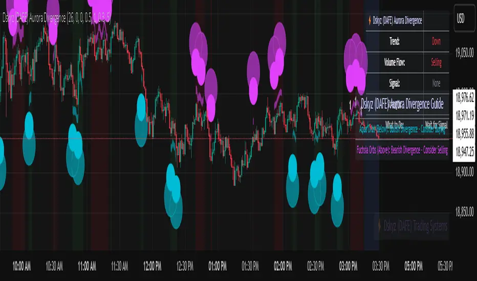
The Dskyz (DAFE) Aurora Divergence Indicator is designed to identify bullish and bearish divergences between the price trend and the On Balance Volume (OBV) trend. Divergence occurs when the price of an asset and a technical indicator (in this case, OBV) move in opposite directions, signaling a potential reversal. This indicator uses linear regression slopes to calculate the trends of both price and OBV over a specified lookback period, detecting when these two metrics are diverging. When a divergence is detected, it highlights potential reversal points with visually striking aurora bands, orbs, and labels, making it easy for traders to spot key signals.
⚙️ Inputs & How to Use Them
The indicator is highly customizable, with inputs grouped under "⚡ DAFE Aurora Settings" for clarity. Here’s how each input works:
Lookback Period: Determines how many bars are used to calculate the price and OBV slopes. Higher values detect longer-term trends (e.g., 20 for 1H charts), while lower values are more responsive to short-term movements.
Price Slope Threshold: Sets the minimum slope value for the price to be considered in an uptrend or downtrend. A value of 0 allows all slopes to be considered, while higher values filter for stronger trends.
OBV Slope Threshold: Similar to the price slope threshold but for OBV. Helps filter out weak volume trends.
Aurora Band Width: Adjusts the width of the visual bands that highlight divergence areas. Wider bands make the indicator more visible but may clutter the chart.
Divergence Sensitivity: Scales the strength of the divergence signals. Higher values make the indicator more sensitive to smaller divergences.
Minimum Strength: Filters out weak signals by only showing divergences above this strength level. A default of 0.3 is recommended for beginners.
Signal Cooldown (Bars): Prevents multiple signals from appearing too close together. Default is 5 bars, reducing chart clutter and helping traders focus on significant signals.
These inputs allow traders to fine-tune the indicator to match their trading style and timeframe.
🚀 What Makes It Unique?
This indicator stands out with its innovative features:
Price-Volume Divergence: Combines price trend (slope) and OBV trend for more reliable signals than price-only divergences.
Aurora Bands: Dynamic visual bands that highlight divergence zones, making it easier to spot potential reversals at a glance.
Interactive Dashboard: Displays real-time information on trend direction, volume flow, signal type, strength, and recommended actions (e.g., "Consider Buying" or "Consider Selling").
Signal Cooldown: Ensures only the most significant divergences are shown, reducing noise and improving usability.
Alerts: Built-in alerts for both bullish and bearish divergences, allowing traders to stay informed even when not actively monitoring the chart.
Beginner Guide: Explains the indicator’s visuals (e.g., aqua orbs for bullish signals, fuchsia orbs for bearish signals), making it accessible for new users.
🎯 Why It Works
The indicator’s effectiveness lies in its use of price-volume divergence, a well-established concept in technical analysis. When the price trend and OBV trend diverge, it often signals a potential reversal because the underlying volume support (or lack thereof) is not aligning with the price action. For example:
Bullish Divergence: Occurs when the price is making lower lows, but the OBV is making higher lows, indicating weakening selling pressure and potential upward reversal.
Bearish Divergence: Occurs when the price is making higher highs, but the OBV is making lower highs, suggesting weakening buying pressure and potential downward reversal.
The use of linear regression ensures smooth and accurate trend calculations over the specified lookback period. The divergence strength is then normalized and filtered based on user-defined thresholds, ensuring only high-quality signals are displayed. Additionally, the cooldown period prevents signal overload, allowing traders to focus on the most significant opportunities.
🧬 Indicator Recommendation
Best For: Traders looking to identify potential trend reversals in any market, especially those where volume data is reliable (e.g., stocks, futures, forex).
Timeframes: Suitable for all timeframes. Adjust the lookback period accordingly—smaller values for shorter timeframes (e.g., 1H), larger for longer ones (e.g., 4H or daily).
Pair With: Support and resistance levels, trend lines, other oscillators (e.g., RSI, MACD) for confirmation, and volume profile tools for deeper analysis.
Tips:
Look for divergences at key support/resistance levels for higher-probability setups.
Pay attention to signal strength; higher strength divergences are often more reliable.
Use the dashboard to quickly assess market conditions before entering a trade.
Set up alerts to catch divergences even when not actively watching the chart.
🧾 Credit & Acknowledgement
This indicator builds upon the classic concept of price-volume divergence, enhancing it with modern visualization techniques, advanced filtering, and user-friendly features. It is designed to provide traders with a powerful yet intuitive tool for spotting reversals.
📌 Final Thoughts
The Dskyz (DAFE) Aurora Divergence Indicator is more than just a divergence tool; it’s a comprehensive trading assistant that combines advanced calculations, intuitive visualizations, and actionable insights. Whether you’re a seasoned trader or just starting out, this indicator can help you spot high-probability reversal points with confidence.
Use it with discipline. Use it with clarity. Trade smarter.
**I will continue to release incredible strategies and indicators until I turn this into a brand or until someone offers me a contract.
-Dskyz
Pesquisar nos scripts por "volume profile"
Volume Flow RatioVolume Flow Ratio (VFR) Indicator
Overview
The Volume Flow Ratio (VFR) is a sophisticated volume analysis tool that measures current trading volume relative to the maximum volume of the previous period. Unlike traditional volume indicators that show raw volume or simple moving averages, VFR provides context by comparing current activity to recent maximum activity levels.
Core Features
1. Split Period Analysis
- Multiple Timeframe Options:
- Daily: Compares to previous day's maximum
- Weekly: Week-to-week comparison
- NYSE Weekly: Specialized for stock market trading (Monday-Friday only)
- Monthly: Month-to-month analysis
- Quarterly: Quarter-to-quarter perspective
- Yearly: Year-over-year volume comparison
2. Ratio-Based Measurement
- Displays volume as a ratio (0 to 1+) rather than raw numbers
- 1.0 represents volume equal to previous period's maximum
- Example: If previous max was 50,000 contracts:
- Current volume of 25,000 shows as 0.5
- Current volume of 75,000 shows as 1.5
3. Triple Coloring Modes
- Moving Average Based:
- Compares current ratio to its moving average
- Customizable MA period
- Green: Above MA (higher than average activity)
- Red: Below MA (lower than average activity)
- Previous Candle Comparison:
- Simple increase/decrease from previous bar
- Green: Higher than previous bar
- Red: Lower than previous bar
- Candle Color Based:
- Syncs with price action
- Green: Bullish candles (close > open)
- Red: Bearish candles (close < open)
Primary Use Cases
1. Volume Profile Analysis
- Perfect for traders who need to understand when markets are most active
- Helps identify unusual volume spikes relative to recent history
- Useful for timing entries and exits based on market participation
2. Market Activity Traders
Ideal for traders who:
- Need to identify high-liquidity periods
- Want to avoid low-volume periods
- Look for volume breakouts or divergences
- Trade based on institutional participation levels
3. Mean Reversion Traders
Helps identify:
- Overextended volume conditions (potential reversals)
- Volume exhaustion points
- Return to normal volume levels after spikes
4. Momentum Traders
Useful for:
- Confirming trend strength through volume
- Identifying potential trend exhaustion
- Validating breakouts with volume confirmation
Advantages Over Traditional Volume Indicators
1. Contextual Analysis
- Shows relative strength rather than raw numbers
- Easier to compare across different time periods
- Automatically adjusts to changing market conditions
2. Period-Specific Insights
- Respects natural market cycles (daily, weekly, monthly)
- Special handling for NYSE trading days
- Eliminates weekend noise in stock market analysis
3. Flexible Visualization
- Three distinct coloring methods for different trading styles
- Clear reference line at 1.0 for quick analysis
- Histogram style for easy pattern recognition
Best Practices
For Day Traders
- Use Daily split for intraday volume patterns
- MA coloring mode with shorter periods (5-10)
- Focus on ratios during market hours
For Swing Traders
- Weekly or NYSE Weekly splits
- Longer MA periods (15-20)
- Look for sustained volume patterns
For Position Traders
- Monthly or Quarterly splits
- Candle color mode for trend confirmation
- Focus on major volume shifts
Limitations
- Requires one full period to establish baseline
- May be less effective in extremely low volume conditions
- NYSE Weekly mode specific to stock market hours
This indicator is particularly valuable for traders who understand that volume is a crucial component of price action but need a more sophisticated way to analyze it than simple volume bars. It's especially useful for those who trade based on market participation levels and need to quickly identify whether current volume is significant relative to recent history.

Session extensions [dani]Session Extension
Indicator Description
The Session Extensions indicator is a customizable tool designed to visually represent key price levels during a specified trading session. It calculates and displays the high, low, and midpoints of the session, along with extension levels based on user-defined multipliers. These extensions help traders identify potential support and resistance zones beyond the initial session range.
This indicator is particularly useful for intraday traders who rely on session-based analysis to make informed decisions. It overlays directly on the chart, ensuring seamless integration with price action.
Key Features
Session-Based Analysis : Tracks and highlights key price levels (high, low, midpoint) during a specific trading session.
Customizable Extension Levels : Allows users to define up to six extension levels (both above and below the session range) with unique multipliers, colors, styles, and widths.
Real-Time Updates : Automatically updates during the active session and resets at the start of a new session.
Usage Guidelines
Add the Indicator to Your Chart : Apply the Session Extensions indicator to your chart to visualize key session-based levels.
Intraday Focus : This indicator is optimized for intraday trading. Ensure that the chart's timeframe is set to an intraday interval (e.g., 1-minute, 5-minute).
Session Alignment : Verify that the session time aligns with your trading schedule and timezone. Misalignment may result in incorrect session detection. (This indicator use America - New York timezone)
Avoid Overcrowding : While the indicator supports multiple extension levels, enabling too many levels simultaneously may clutter the chart. Use discretion when configuring extension levels.
Customize Line Styles and Colors : Tailor the appearance of lines and labels to align with your trading style. Use solid, dashed, or dotted lines, and choose colors that enhance visibility without cluttering the chart.
Combine with Other Tools : Pair this indicator with other technical analysis tools (e.g., moving averages, volume profiles) to enhance decision-making.
Disclaimer & Chat
The Session Extensions indicator is intended for educational and analytical purposes only. It does not provide financial advice or guarantee trading success. Users are responsible for verifying the accuracy of session times and ensuring proper configuration before using the indicator in live trading. This indicator is not a trading signal generator.
Thank you for choosing this indicator! I hope it becomes a valuable part of your trading toolkit. Remember, trading is a journey, and having the right tools can make all the difference. Whether you're a seasoned trader or just starting out, this indicator is designed to help you stay organized and focused on what matters most—price action. Happy trading, and may your charts be ever in your favor! 😊
From, Dani.

NIFTY VWAP DistanceNIFTY Futures VWAP Distance Indicator
Track price deviation from Volume-Weighted Average Price in real-time
📈 Key Features:
Measures absolute (points) and percentage distance from VWAP
Daily session reset aligned with NSE trading hours
Dual-axis visualization with clear zero reference line
Real-time data table display for instant analysis
Typical price calculation: (H+L+C)/3 formula
Built-in safeguards against division errors
🎯 Ideal For:
Intraday traders monitoring mean reversion opportunities
Algorithmic traders needing VWAP deviation metrics
Swing traders identifying overextended price moves
Market profile analysts studying auction theory
📊 How to Use:
Apply to NIFTY Futures chart (1m-1h timeframes recommended)
Blue line = Points above/below VWAP
Red line = Percentage deviation
Positive values = Price > VWAP (bullish territory)
Negative values = Price < VWAP (bearish territory)
💡 Pro Tips:
Combine with volume profile for confirmation
Watch for >1% deviations for potential reversals
Use divergence patterns for early trend change signals
Works best with raw futures data (not continuous contracts)
🔧 Technical Specs:
Pine Script v5+
No repainting
Low latency calculations
Mobile-friendly display
"Know when price strays too far from fair value"

Footprint Chart by Th16rryDescription of the "Footprint Chart" Indicator
This indicator is an approximation of a true **Footprint Chart** adapted for TradingView, which does not provide access to tick-by-tick data or detailed order book information. It relies on **heuristics** to estimate the distribution of volume between buyers and sellers for each candlestick.
Key Features:
- Estimation of Buy/Sell Volume:
The indicator splits the total volume of a candlestick into two parts based on the candle's nature:
- For a bullish candle (close > open), it assumes that **60% of the volume** is executed on the ask (buys) and **40% on the bid** (sells).
- For a bearish candle (close < open), the estimation is reversed (40% buys, 60% sells).
- For a neutral candle (close = open), the volume is evenly distributed at 50% for each side.
- Calculation of a Simplified Delta:
The delta is defined as the difference between the estimated buy volume and sell volume. This delta helps quickly identify the dominant market pressure—positive for buyer dominance and negative for seller dominance.
- Visual Display:
- A label is placed on each candlestick displaying the delta value, with a green background for a positive delta (indicating buying pressure) and red for a negative delta (indicating selling pressure).
- A table in the top-right corner of the chart summarizes the estimated volumes for the current candle: buy volume, sell volume, and total volume.
#### How to Use the Indicator:
- Analyzing Buy/Sell Pressure:
By observing the label's color and the delta value, a trader can quickly assess whether the market shows a dominant buying or selling pressure during a given candle.
- Complementing Other Tools:
This indicator can be used alongside other technical analysis tools, such as the Volume Profile or trend indicators, to gain a more comprehensive understanding of market behavior.
- Supporting Decision Making:
By providing a visual estimate of the volume distribution, it can help identify divergences between price movement and volume activity, which may signal potential reversals or confirm ongoing trends.
Limitations:
- Heuristic Approximation:
The method of volume distribution is based on simple assumptions and does not reflect the actual order flow, which would require tick-by-tick data to be accurately represented.
- Data Limitations on TradingView:
Due to TradingView’s restrictions on accessing detailed order book data, this indicator can only approximate a Footprint Chart and does not replace specialized tools.
In summary, the "Footprint Chart" indicator provides a visual and quick estimation of the volume distribution between buyers and sellers for each candlestick, offering valuable insights into order flow dynamics while remaining aware of its heuristic limitations.

Value Area - Day Trading SuiteValue Area Day Trading Suite
A professional-grade indicator designed specifically for day traders who utilize Volume Profile and Auction Market Theory. This suite provides tracking of previous day's value areas, helping traders identify how current price interacts with these established institutional levels.
It tracks how much time has spent within the value area without Level to Help Measure Acceptance
Key Features
- Previous Day's Value Area tracking (VAH, POC, VAL)
- Precise time-in-value-area measurement
- Cash session integration with major market timezones
- Value Area acceptance alerts
Trading Applications
Perfect for day traders who:
- Trade using previous day's Volume Profile levels
- Focus on institutional price acceptance/rejection
- Trade market structure using confirmed value areas
- Want to automate their value area analysis
- Trade during specific market sessions
Value Area Analysis
The indicator tracks how long price stays within the previous day's value area, helping traders:
- Identify Potential Support / Resistance Levels
- Spot acceptance of established levels
- Find high-probability trading opportunities
- Time their entries and exits more effectively
Professional Tools
- Customizable cash session times for different markets
- Multiple timezone support
- Flexible dashboard positioning
- Clean, professional appearance with adjustable colors
- Alert system for value area acceptance
Built for day traders who utilize value areas

Footprint IQ Pro [TradingIQ]Hello Traders!
Introducing "Footprint IQ Pro"!
Footprint IQ Pro is an all-in-one Footprint indicator with several unique features.
Features
Calculated delta at tick level
Calculated delta ratio at tick level
Calculated buy volume at tick level
Calculated sell volume at tick level
Imbalance detection
Stacked imbalance detection
Stacked imbalance alerts
Value area and POC detection
Highest +net delta levels detection
Lowest -net delta levels detection
CVD by tick levels
Customizable values area percentage
The image above thoroughly outlines what each metric in the delta boxes shows!
Metrics In Delta Boxes
"δ:", "\nδ%:", "\n⧎: ", "\n◭: ", "\n⧩: "
δ Delta (Difference between buy and sell volume)
δ% Delta Ratio (Delta as a percentage of total volume)
⧎ Total Volume At Level (Total volume at the price area)
◭ Total Buy Volume At Level (Total buy volume at the price area)
⧩ Total Sell Volume At Level (total sell volume at the price area)
Each metric comes with a corresponding symbol.
That said, until you become comfortable with the symbol, you can also turn on the descriptive labels setting!
The image above exemplifies the feature.
The image above shows Footprint IQ's full power!
Additionally, traders with an upgraded TradingView plan can make use of the "1-Second" feature Footprint IQ offers!
The image above shows each footprint generated using 1-second volume data. 1-second data is highly granular compared to 1-minute data and, consequently, each footprint is exceptionally more accurate!
Imbalance Detection
Footprint IQ pro is capable of detecting user-defined delta imbalances.
The image above further explains how Footprint IQ detects imbalances!
The imbalance percentage is customizable in the settings, and is set to 70% by default.
Therefore,
When net delta is positive, and the positive net delta constitutes >=70% of the total volume, a buying imbalance will be detected (upwards triangle).
When net delta is negative, and the negative net delta constitutes >=70% of the total volume, a buying imbalance will be detected (downwards triangle).
Stacked Imbalance Detection
In addition to imbalance detection, Footprint IQ Pro can also detect stacked imbalances!
The image above shows Footprint IQ Pro detecting stacked imbalances!
Stacked imbalances occur when consecutive imbalances at sequential price areas occur. Stacked imbalances are generally interpreted as significant price moves that are supported by volume, rather than a significant result with disproportionate effort.
The criteria for stacked imbalance detection (how many imbalances must occur at sequential price areas) is customizable in the settings.
The default value is three. Therefore, when three imbalances occur at sequential price areas, golden triangles will begin to print to show a stacked imbalance.
Additionally, traders can set alerts for when stacked imbalances occur!
Highest +Delta and Highest -Delta Levels
In addition to being a fully-fledged Footprint indicator, Footprint IQ Pro goes one step further by detecting price areas where the greater +Delta and -Delta are!
The image above shows price behavior near highest +Delta price areas detected by Footprint IQ!
These +Delta levels are considered important as there has been strong interest from buyers at these price areas when they are traded at.
It's expected that these levels can function as support points that are supported by volume.
The image above shows a similar function for resistance points!
Blue lines = High +Delta Detected Price Areas
Red lines = High -Delta Detected Price Areas
Value Area Detection
Similar to traditional volume profile, Footprint IQ Pro displays the value area per bar.
Green lines next to each footprint show the value area for the bar. The value area % is customizable in the settings.
CVD Levels
Footprint IQ Pro is capable of storing historical volume delta information to provide CVD measurements at each price area!
The image above exemplifies this feature!
When this feature is enabled, you will see the CVD of each price area, rather than the net delta!
And that's it!
Thank you so much to TradingView for offering the greatest charting platform for everyone to create on!
If you have any feature requests you'd like to see for Footprint IQ, please feel free to share them with us!
Thank you!

Altcoins Screener [SwissAlgo]Introduction: The Altcoins Screener at a Glance
The Altcoins Screener is a cryptocurrency analysis tool designed to provide an overview of potential trading opportunities across multiple crypto coins/tokens and categories. By combining technical analysis, price action assessment, and social metrics (via LunarCrush data), it presents market information and trading signals for a broad range of altcoins (approx. 300 USDT.P pairs of 9 crypto categories).
The screener is designed to consolidate market information onto a single chart , aiming to streamline the analysis of market conditions. It provides a consolidated market overview, which can simplify the assessment of market conditions, compared to monitoring individual charts with several layered indicators.
Key Features:
🔹 Multi-category analysis covering 300 crypto pairs of 9 categories on a single chart (Layer 1 & Top Coins, Layer2 & Scaling, Defi & Landing, Gaming & Metaverse, AI & Data, Exchanges & Trading, NFT & Social, Memes & Community, Other, User's Custom Portfolio).
🔹 Technical analysis with trade signals (Long/Short) based on an aggregated view of technical and social data points
🔹 Social sentiment integration through LunarCrush metrics (GalaxyScore, AltRank, Social Sentiment)
🔹 Real-time market scanning provides automated alerts when market conditions for specified coins/tokens potentially change.
🔹 Custom watchlist support for personalized monitoring (users can define a custom category containing a set of specific cryptocurrencies, i.e. own portfolio).
The screener presents data in a table format, using color-coded indicators to aid visual analysis. Detailed technical information is also provided. The assessments/trade signals provided by this indicator should be considered as one input among many when forming your trading strategy.
--------------------------------------
What It Does
The Altcoins Screener is a cryptocurrency analysis tool that offers:
Data Display and Analysis (Technical/Social):
🔹 Technical Metrics
* Technical Raw Data : Displays raw values for a range of technical indicators, including RSI, Stochastic RSI, DMI/ADX, RVI, ATR, OBV, and Hull Moving Averages (including their recent trends and potential significance).
Detailed view of key technical indicators, for further analysis and evaluation:
* Technical Analysis (Summary) : Provides a summarized interpretation of technical conditions based on aggregated parameters:
* Price Action
* Trend
* Momentum
* Volatility
* Volume
Summarized view of confluences for potential long/short bias:
🔹 Social Metrics (LunarCrush) : Presents data from LunarCrush®, including Galaxy Score®, AltRank®, and Social Sentiment® (including their recent trends and potential significance).
Lunarcrush data for the top 10 coins for each crypto category:
🔹 PVSRA (Price Volume & Market Makers Activity) Candles : Shows special candles highlighting potential market maker activity and volume anomalies, helping identify possible manipulation zones (including imbalance zones, i.e. price areas that market makers may revisit)
--------------------------------------
Key Features:
Automated trade signals (Long/Short) are generated based on algorithmic calculations and signal confidence levels across technical and social data points. These signals are intended to be used as one component of a broader trading strategy.
Custom sensitivity settings allow users to adjust the analysis timeframe (options: 1D, 2D, or 1W). Higher timeframes may provide a broader perspective, while the 2D setting is the default configuration.
Multi-category analysis covering a selection of approximately 300 crypto pairs across 9 predefined crypto categories.
Custom symbol selection: Users can define a custom list of up to 10 symbols for focused monitoring.
Automated Alerts to track potential trend changes across crypto categories (Long to Short to Neutral, or vice versa)
Visual Interface:
Organized table display with color-coded indicators to aid interpretation.
Clear and efficient format for scanning market information.
--------------------------------------
Target Audience
🔹 The screener is designed for cryptocurrency traders who:
Need to efficiently monitor multiple USDT perpetual futures markets
Use technical analysis in their trading decisions
Want to track sector-wide movements across crypto categories
🔹 Suitable for different trading styles:
Scalpers requiring quick market assessment
Swing traders analyzing multi-day trends
Position traders monitoring longer-term setups
The color-coded interface makes it accessible for intermediate traders while providing detailed metrics for advanced users. A basic understanding of technical analysis and crypto trading is recommended.
--------------------------------------
How It Works
The Altcoins Screener evaluates cryptocurrencies through a multi-layered analysis:
🔹 Core Analysis Components
Each parameter combines multiple indicators for comprehensive evaluation:
Price Action
EMA crossovers and momentum
Support/resistance zones
Candlestick patterns
Trend
Hull Moving Average system
DMI/ADX trend strength
Multi-timeframe confirmation
Momentum
RSI/Stochastic RSI readings
MACD convergence/divergence
Oscillator confirmations
Volatility
RVI/ATR measurements
Bollinger Bands behavior
Historical volatility trends
Volume
OBV trend analysis
Volume/price correlations
Volume profile assessment
🔹 Signal Generation Process
1. Real-time data collection across timeframes
2. Weighted indicator calculations
3. Parameter aggregation and analysis
4. Signal strength determination
5. Color-coding and alert generation
--------------------------------------
How to Use
🔹 Initial Setup:
Add the indicator to a chart (use the 1D timeframe)
Select your preferred crypto category or create a custom list
Choose between Technical Analysis or Technical Metrics view
Set data sensitivity based on your trading style
🔹 Using the Technical Analysis View:
Monitor color-coded dots for quick market assessment
Green: bullish conditions
Red: bearish conditions
Gray: neutral conditions
Check the "Trade Signal" column for potential Long/Short entries signaled by confluences among technical and/or social data points
🔹 Using the Technical Metrics View:
Review detailed numerical values
Monitor slopes (↑↓ arrows) for the most recent trend direction of each data point
Watch for pivotal points (highlighted cells): these are data points that suggest potential trend reversals
Focus on the confluence of multiple indicators
The technical metrics view corroborates the conclusions shown in the Technical Analysis View, providing more details about some critical data points.
🔹 Alert Configuration:
Enable Technical Alerts for signal notifications (which coin/token seems most suited for Long or Short trades, and which coin/token is in a neutral/uncertain state for trading = "No Trade")
Configure alert conditions based on trading style
Set timeframe-appropriate sensitivity
Monitor alert messages for trade signals
Instructions on how to set alerts are provided in the script (enable "Signals Setup Instructions" in User Interface to get a step-by-step guide about setting up alerts)
Best Practices:
Confirm signals across multiple timeframes
Use appropriate sensitivity for your trading style
Monitor multiple categories for sector rotation
Combine signals with your trading strategy
Verify signals with price action confirmation and deep dive into the charts of your potential targets
--------------------------------------
About the Settings
🔹 Crypto Category Selection
Layer 1 & Major: Top market cap coins (BTC, ETH, XRP,...), established protocols
Layer 2 & Scaling: ETH L2s, scaling solutions
DeFi & Lending: Decentralized finance protocols
Gaming & Metaverse: Gaming and virtual world tokens
AI & Data: Artificial intelligence and data projects
Exchange & Trading: Exchange tokens, trading protocols
NFT & Social: NFT platforms, social tokens
Memes & Community: Community-driven tokens
Others & Misc: Other categories
Custom Category: User-defined list (up to 10 symbols)
Data Type Options
Technical Analysis: Color-coded summary view
Technical Metrics: Detailed numerical values of some key technical data points
Sensitivity Settings
Higher: Shorter timeframe, more frequent signals
Default: Balanced timeframe, standard signals
Lower: Longer timeframe, stronger signals
Alert Settings
Technical Alerts: Trade signal notifications
Data Timeframe: Minimum 1D required
Theme: Dark/Light mode options
Note: All analysis is performed on USDT Perpetual Futures pairs from Binance
--------------------------------------
FAQ
Q: Does the screener work on other exchanges besides Binance?
A: No, it's designed specifically for Binance USDT Perpetual Futures pairs. Binance offers the highest liquidity and trading volume in the crypto derivatives market, making it ideal for technical analysis. The extensive range of trading pairs and reliable data streams help ensure more accurate signals and analysis. Using a single high-liquidity exchange also helps avoid inconsistencies that could arise from aggregating data across multiple platforms with varying liquidity levels.
Q: What's the minimum timeframe required?
A: The screener requires a minimum 1D (daily) timeframe. This requirement ensures that the technical analysis has sufficient data points for reliable signal generation. Lower timeframes can produce more noise and false signals, while daily timeframes help filter out market noise and identify stronger trends.
Q: Why are some social metrics showing "NaN"?
A: "NaN" (Not a Number) appears when cryptocurrencies don't have associated LunarCrush data. This typically occurs with newer tokens or those with lower market caps. The technical analysis remains fully functional regardless of social metric availability, as these are complementary data points.
Q: How often are signals updated?
A: Signals update with each new candle on the selected timeframe (1D, 2D, or 1W). For example, on the default 2D setting, signals are recalculated every two days as new candles form. This helps reduce noise while maintaining timely analysis of market conditions.
Q: Can I add spot trading pairs?
A: No, the screener is optimized for Binance USDT perpetual futures pairs for data consistency and analysis purposes. While spot and perpetual prices typically align closely due to arbitrage, using a single data source (Binance) and contract type (USDT perpetual) ensures uniform data quality and analysis across all pairs. This standardization helps maintain reliable technical analysis and signal generation.
Q: How many coins can I add to my custom list?
A: Users can add up to 10 custom symbols to their watchlist. This limit is designed to maintain optimal performance while allowing focused monitoring of specific assets. The custom list complements the predefined categories that cover over 300 pairs.
Q: What determines signal confidence levels?
A: Signal confidence is calculated through a weighted algorithm that considers multiple factors: trend strength (Hull MA, DMI/ADX), momentum indicators (RSI, SRSI), volatility measurements (RVI, ATR, BB), volume analysis (OBV, volume trends), and price action patterns. Higher confidence levels indicate stronger alignment across these factors.
Q: Are signals guaranteed to work?
A: No. Signals are analytical tools based on historical and current market data, not guaranteed predictions. They should be used as one component of a comprehensive trading strategy that includes proper risk management, position sizing, and additional confirmation factors. Past performance does not guarantee future results.
Q: Why does the screener need higher timeframes?
A: Higher timeframes (1D minimum) provide several benefits: reduced market noise, more reliable technical signals, better trend identification, and lower likelihood of false signals. They also align better with institutional trading patterns and allow for a more thorough analysis of market conditions across multiple indicators.
--------------------------------------
Conclusion
The Altcoins Screener is a comprehensive crypto market analysis tool that:
Scans 300+ cryptocurrencies across 9 sectors on a single chart
Combines technical indicators and social metrics for signal generation
Identifies potential trading opportunities through color-coded visuals
Saves time by eliminating the need to monitor multiple charts
The tool is suited for:
Market overview and sector rotation analysis
Quick assessment of market conditions
Technical and social sentiment tracking
Systematic trading approach with alerts
Use this screener with caution and as a complement to any other tool you use to define your trading strategy.
--------------------------------------
Disclaimer
This indicator is for informational and educational purposes only:
Not financial advice: This indicator should not be considered investment advice.
No guarantee of accuracy: The indicator's calculations and signals are based on specific algorithms and data sources, but accuracy cannot be guaranteed. Market conditions can change rapidly.
Past performance is not predictive: Past performance of the indicator's signals or any specific asset is not indicative of future results.
Substantial risk of loss: Trading cryptocurrencies involves a substantial risk of loss. You can lose money trading these assets.
User responsibility: Users are solely responsible for their own trading decisions and should exercise caution.
Independent research required: Always conduct thorough independent research (DYOR) before making any trading decisions.
Technical analysis is one of many tools: Technical analysis, including the output of this indicator, is just one tool among many and should not be relied upon exclusively.
Risk management is essential: Use proper risk management techniques, including position sizing and stop-loss orders.
Comprehensive strategy: Use this tool as part of a comprehensive trading strategy, not as a standalone solution.
No liability for trading results: The Author assumes no responsibility or liability for any trading results or losses incurred as a result of using this indicator.
No TradingView affiliation: SwissAlgo is an independent entity and is not affiliated with or endorsed by TradingView.
LunarCrush data: The indicator utilizes publicly available data from LunarCrush. LunarCrush data and trademarks are the property of LunarCrush.
Consult a financial advisor: Consult with a qualified financial advisor before making any investment decisions.
By using this indicator, you acknowledge and agree to these terms. If you do not agree with these terms, please refrain from using this indicator.

Uptrick: Smart BoundariesThis script is an indicator that combines the RSI (Relative Strength Index) and Bollinger Bands to highlight potential points where price momentum and volatility may both be at extreme levels. Below is a detailed explanation of its components, how it calculates signals, and why these two indicators have been merged into one tool. This script is intended solely for educational purposes and for traders who want to explore the combined use of momentum and volatility measures. Please remember that no single indicator guarantees profitable results.
Purpose of This Script
This script is designed to serve as a concise, all-in-one tool for traders seeking to track both momentum and volatility extremes in real time. By overlaying RSI signals with Bollinger Band boundaries, it helps users quickly identify points on a chart where price movement may be highly stretched. The goal is to offer a clearer snapshot of potential overbought or oversold conditions without requiring two separate indicators. Additionally, its optional pyramiding feature enables users to manage how many times they initiate trades when signals repeat in the same direction. Through these combined functions, the script aims to streamline technical analysis by consolidating two popular measures—momentum via RSI and volatility via Bollinger Bands—into a single, manageable interface.
1. Why Combine RSI and Bollinger Bands
• RSI (Relative Strength Index): This is a momentum oscillator that measures the speed and magnitude of recent price changes. It typically ranges between 0 and 100. Traders often watch for RSI crossing into “overbought” or “oversold” levels because it may indicate a potential shift in momentum.
• Bollinger Bands: These bands are plotted around a moving average, using a standard deviation multiplier to create an upper and lower boundary. They help illustrate how volatile the price has been relative to its recent average. When price moves outside these boundaries, some traders see it as a sign the price may be overstretched and could revert closer to the average.
Combining these two can be useful because it blends two different perspectives on market movement. RSI attempts to identify momentum extremes, while Bollinger Bands track volatility extremes. By looking for moments when both conditions agree, the script tries to highlight points where price might be unusually stretched in terms of both momentum and volatility.
2. How Signals Are Generated
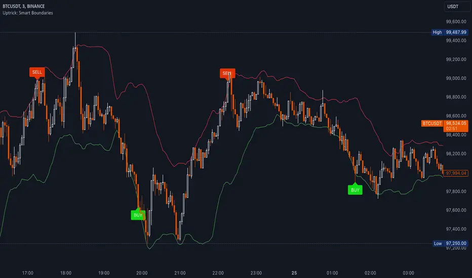
• Buy Condition:
- RSI dips below a specified “oversold” level (for example, 30 by default).
- Price closes below the lower Bollinger Band.
When these occur together, the script draws a label indicating a potential bullish opportunity. The underlying reasoning is that momentum (RSI) suggests a stronger-than-usual sell-off, and price is also stretched below the lower Bollinger Band.
• Sell Condition:
- RSI rises above a specified “overbought” level (for example, 70 by default).
- Price closes above the upper Bollinger Band.
When these occur together, a label is plotted for a potential bearish opportunity. The rationale is that momentum (RSI) may be overheated, and the price is trading outside the top of its volatility range.
3. Pyramiding Logic and Trade Count Management
• Pyramiding refers to taking multiple positions in the same direction when signals keep firing. While some traders prefer just one position per signal, others like to scale into a trade if the market keeps pushing in their favor.
• This script uses variables that keep track of how many recent buy or sell signals have fired. If the count reaches a user-defined maximum, no more signals of that type will trigger additional labels. This protects traders from over-committing to one direction if the market conditions remain “extreme” for a prolonged period.
• If you disable the pyramiding feature, the script will only plot one label per side until the condition resets (i.e., until RSI and price conditions are no longer met).
4. Labels and Visual Feedback
• Whenever a buy or sell condition appears, the script plots a label directly on the chart:
- Buy labels under the price bar.
- Sell labels above the price bar.
These labels make it easier to review where both RSI and Bollinger Band conditions align. It can be helpful for visually scanning the chart to see if the signals show any patterns related to market reversals or trend continuations.
• The Bollinger Bands themselves are plotted so traders can see when the price is approaching or exceeding the upper or lower band. Watching the RSI and Bollinger Band plots simultaneously can give traders more context for each signal.
5. Originality and Usefulness
This script provides a distinct approach by merging two well-established concepts—RSI and Bollinger Bands—within a single framework, complemented by optional pyramiding controls. Rather than using each indicator separately, it attempts to uncover moments when momentum signals from RSI align with volatility extremes highlighted by Bollinger Bands. This combined perspective can aid in spotting areas of possible overextension in price. Additionally, the built-in pyramiding mechanism offers a method to manage multiple signals in the same direction, allowing users to adjust how aggressively they scale into trades. By integrating these elements together, the script aims to deliver a tool that caters to diverse trading styles while remaining straightforward to configure and interpret.
6. How to Use the Indicator
• Configure the Inputs:
- RSI Length (the lookback period used for the RSI calculation).
- RSI Overbought and Oversold Levels.
- Bollinger Bands Length and Multiplier (defines the moving average period and the degree of deviation).
- Option to reduce pyramiding.
• Set Alerts (Optional):
- You can create TradingView alerts for when these conditions occur, so you do not have to monitor the chart constantly. Choose the buy or sell alert conditions in your alert settings.
• Integration in a Trading Plan:
- This script alone is not a complete trading system. Consider combining it with other forms of analysis, such as support and resistance, volume profiles, or candlestick patterns. Thorough research, testing on historical data, and risk management are always recommended.
7. No Performance Guarantees
• This script does not promise any specific trading results. It is crucial to remember that no single indicator can accurately predict future market movements all the time. The script simply tries to highlight moments when two well-known indicators both point to an extreme condition.
• Actual trading decisions should factor in a range of market information, including personal risk tolerance and broader market conditions.
8. Purpose and Limitations
• Purpose:
- Provide a combined view of momentum (RSI) and volatility (Bollinger Bands) in a single script.
- Assist in spotting times when price may be at an extreme.
- Offer a configurable system for labeling potential buy or sell points based on these extremes.
• Limitations:
- Overbought and oversold conditions can persist for an extended period in trending markets.
- Bollinger Band breakouts do not always result in immediate reversals. Sometimes price keeps moving in the same direction.
- The script does not include a built-in exit strategy or risk management rules. Traders must handle these themselves.
Additional Disclosures
This script is published open-source and does not rely on any external or private libraries. It does not use lookahead methods or repaint signals; all calculations are performed on the current bar without referencing future data. Furthermore, the script is designed for standard candlestick or bar charts rather than non-standard chart types (e.g., Heikin Ashi, Renko). Traders should keep in mind that while the script can help locate potential momentum and volatility extremes, it does not include an exit strategy or account for factors like slippage or commission. All code comes from built-in Pine Script functions and standard formulas for RSI and Bollinger Bands. Anyone reviewing or modifying this script should exercise caution and incorporate proper risk management when applying it to their own trading.
Calculation Details
The script computes RSI by examining a user-defined number of prior bars (the RSI Length) and determining the average of up-moves relative to the average of down-moves over that period. This ratio is then scaled to a 0–100 range, so lower values typically indicate stronger downward momentum, while higher values suggest stronger upward momentum. In parallel, Bollinger Bands are generated by first calculating a simple moving average (SMA) of the closing price for the user-specified length. The script then measures the standard deviation of closing prices over the same period and multiplies it by the chosen factor (the Bollinger Bands Multiplier) to form the upper and lower boundaries around the SMA. These two measures are checked in tandem: if the RSI dips below a certain oversold threshold and price trades below the lower Bollinger Band, a condition is met that may imply a strong short-term sell-off; similarly, if the RSI surpasses the overbought threshold and price rises above the upper Band, it may indicate an overextended move to the upside. The pyramiding counters track how many of these signals occur in sequence, preventing excessive stacking of labels on the chart if conditions remain extreme for multiple bars.
Conclusion
This indicator aims to provide a more complete view of potential market extremes by overlaying the RSI’s momentum readings on top of Bollinger Band volatility signals. By doing so, it attempts to help traders see when both indicators suggest that the market might be oversold or overbought. The optional reduced pyramiding logic further refines how many signals appear, giving users the choice of a single entry or multiple scaling entries. It does not claim any guaranteed success or predictive power, but rather serves as a tool for those wanting to explore this combined approach. Always be cautious and consider multiple factors before placing any trades.
Scatter PlotThe Price Volume Scatter Plot publication aims to provide intrabar detail as a Scatter Plot .
🔶 USAGE
A dot is drawn at every intrabar close price and its corresponding volume , as can seen in the following example:
Price is placed against the white y-axis, where volume is represented on the orange x-axis.
🔹 More detail
A Scatter Plot can be beneficial because it shows more detail compared with a Volume Profile (seen at the right of the Scatter Plot).
The Scatter Plot is accompanied by a "Line of Best Fit" (linear regression line) to help identify the underlying direction, which can be helpful in interpretation/evaluation.
It can be set as a screener by putting multiple layouts together.
🔹 Easier Interpretation
Instead of analysing the 1-minute chart together with volume, this can be visualised in the Scatter Plot, giving a straightforward and easy-to-interpret image of intrabar volume per price level.
One of the scatter plot's advantages is that volumes at the same price level are added to each other.
A dot on the scatter plot represents the cumulated amount of volume at that particular price level, regardless of whether the price closed one or more times at that price level.
Depending on the setting "Direction" , which sets the direction of the Volume-axis, users can hoover to see the corresponding price/volume.
🔹 Highest Intrabar Volume Values
Users can display up to 5 last maximum intrabar volume values, together with the intrabar timeframe (Res)
🔹 Practical Examples
When we divide the recent bar into three parts, the following can be noticed:
Price spends most of its time in the upper part, with relative medium-low volume, since the intrabar close prices are mostly situated in the upper left quadrant.
Price spends a shorter time in the middle part, with relative medium-low volume.
Price moved rarely below 61800 (the lowest part), but it was associated with high volume. None of the intrabar close prices reached the lowest area, and the price bounced back.
In the following example, the latest weekly candle shows a rejection of the 45.8 - 48.5K area, with the highest volume at the 45.8K level.
The next three successive candles show a declining maximum intrabar volume, after which the price broke through the 45.8K area.
🔹 Visual Options
There are many visual options available.
🔹 Change Direction
The Scatter Plot can be set in 4 different directions.
🔶 NOTES
🔹 Notes
The script uses the maximum available resources to draw the price/volume dots, which are 500 boxes and 500 labels. When the population size exceeds 1000, a warning is provided ( Not all data is shown ); otherwise, only the population size is displayed.
The Scatter Plot ideally needs a chart which contains at least 100 bars. When it contains less, a warning will be shown: bars < 100, not all data is shown
🔹 LTF Settings
When 'Auto' is enabled ( Settings , LTF ), the LTF will be the nearest possible x times smaller TF than the current TF. When 'Premium' is disabled, the minimum TF will always be 1 minute to ensure TradingView plans lower than Premium don't get an error.
Examples with current Daily TF (when Premium is enabled):
500 : 3 minute LTF
1500 (default): 1 minute LTF
5000: 30 seconds LTF (1 minute if Premium is disabled)
🔶 SETTINGS
Direction: Direction of Volume-axis; Left, Right, Up or Down
🔹 LTF
LTF: LTF setting
Auto + multiple: Adjusts the initial set LTF
Premium: Enable when your TradingView plan is Premium or higher
🔹 Character
Character: Style of Price/Volume dot
Fade: Increasing this number fades dots at lower price/volume
Color
🔹 Linear Regression
Toggle (enable/disable), color, linestyle
Center Cross: Toggle, color
🔹 Background Color
Fade: Increasing this number fades the background color near lower values
Volume: Background color that intensifies as the volume value on the volume-axis increases
Price: Background color that intensifies as the price value on the price-axis increases
🔹 Labels
Size: Size of price/volume labels
Volume: Color for volume labels/axis
Price: Color for price labels/axis
Display Population Size: Show the population size + warning if it exceeds 1000
🔹 Dashboard
Location: Location of dashboard
Size: Text size
Display LTF: Display the intrabar Lower Timeframe used
Highest IB volume: Display up to 5 previous highest Intrabar Volume values

James Gordon StrategyThis strategy is designed to identify potential bullish “bounce” points off a long-term moving average, specifically the 200-period Exponential Moving Average (EMA), on a 4-hour chart. The logic behind the strategy assumes that when price action interacts with this key support level and then closes above it, buyers are showing renewed interest and strength at that price level.
How It Works:
1. Focus on the 200 EMA:
The 200 EMA is often considered a long-term trend indicator. Price trading above the 200 EMA generally suggests an uptrend, while price trading below it suggests a downtrend. By targeting bounces on this EMA, the strategy looks for moments when price is demonstrating a willingness to hold or reclaim a pivotal support level.
2. Bounce Condition:
A “bounce” is defined by two key criteria:
- Test of Support: During the chosen candle (4-hour timeframe), the low price of the candle reaches the 200 EMA or dips just below it, indicating the market is testing that support zone.
- Close Above the EMA: By the end of that same candle, the price closes above the 200 EMA, signaling that buyers stepped in and defended that level.
3. Why This Matters:
When a candle’s low touches or moves below an important moving average, it might appear that the price could break down further. However, if the candle still manages to close above this moving average, it indicates resilience and potential bullish momentum. This can be an early sign of a price rebound, potentially offering a trading opportunity for those looking to go long.
4. Practical Use:
- Entry Signals: Traders may use these bounce signals to time entries, betting on the idea that price could move higher now that key support has held.
- Stop Placement and Risk Management: Traders can define their risk by placing stops just below the recent low or slightly under the 200 EMA.
- Market Context: To maximize its usefulness, traders should combine the bounce condition with other indicators, market structure analysis, and fundamental insights.
Traders should consider the overall trend, momentum indicators, volume profiles, or macro events to increase confidence in the signal.
In essence, the strategy aims to highlight moments when price action “bounces” off a crucial support level, potentially signaling a favorable entry point for bullish trades.

Bull Bear Candles with Volume ProfileUser Guide for Bull Bear Candles Indicator with Keltner Channels
Author: NellyN
Introduction
This indicator helps identify potential bullish and bearish trends in the market by analyzing buying and selling volume over two configurable timeframes. It calculates the percentage of buying and selling volume and displays the current market condition based on two moving averages for 2 periods.
Key Features
• Volume Analysis : Calculates Buy and Sell Volume for two configurable timeframes (e.g., 5 min, 15 min, 15 min. and 1 hour, etc.) and displays them as percentages.
• Moving Averages : Uses one Moving Average (MA) for two different time periods to identify trends (uptrend when shorter-term MA is above longer-term MA). You can also choose other Moving Average types like SMA, EMA, WMA, RMA, VWMA, or HMA.
• Colored Candles : Candles are colored green for bullish conditions, red for bearish conditions, and gray for neutral conditions.
• Market Condition Labels : Displays labels in table-view indicating the current market condition based on Buy and Sell Volume (Very Bullish, Very Bearish, Bullish/Bearish Retracement, Chop).
• Alerts: Generates alerts for potential buy and sell signals based on indicator conditions (Note: Enable alerts in the indicator settings).
• Visual Signals: Provides visual signals through colored candles and market condition labels in addition to alerts.
Input Parameters
• Source: Close price (default) or Heikin Ashi
• Timeframe: Select the timeframe for price and volume data used in the indicator (e.g., Daily, Hourly).
• Colored Candles On: Enable (True) or disable (False) coloring candles based on market conditions.
• Enable Alerts: Enable (True) or disable (False) alerts for buy/sell signals.
• Length of MA: Sets the length for the MAs used in trend identification (minimum 1).
• Lookback Period Vol. 1 & 2: Define the timeframes used to calculate buying and selling volume and the MA calculation (e.g., 5 min, 15 min).
Understanding the Outputs
• Cloud Fill: The area between two MAs is filled with a color that reflects the trend (green for uptrend, red for downtrend).
• Table: Shows Buy Volume, Sell Volume, Buy Percentage, Sell Percentage, and the current Market Condition Labels. (If you decide to see them uncomment them from the code simply removing the // in front of the code)
• Colored Candles and Market Condition Labels: Look for green candles and bullish labels for potential buying opportunities, and vice versa for red candles and bearish labels.
Bullish green label appears when short-term MA is above long-term MA AND Buy Volume percentage is greater than 50%.
Red cross for exiting long entry appears when we have bearish volume OR bearish crossover of the MA for the 2 periods.
Bearish red label appears when short-term MA is below long-term MA AND Buy Volume percentage is less than 50%.
Green cross for exiting short entry appears when we have bullish volume OR bullish crossover of the MA for the 2 periods.
• Bullish/Bearish Retracement: The moving averages indicate a potential trend reversal, while the Buy Volume percentage suggests a continuation of the prior trend. The candle color may be green, red, or gray depending on the current price position relative to the moving averages.
• Chop (Gray Candle): The moving averages are flat and the Buy Volume percentage is not significantly above or below 50%.
• Buy/Sell Alerts: The indicator generates alerts based on specific conditions, but these should be used in conjunction with other trading strategies and careful risk management.
Important Notes
• This indicator is for informational purposes only and should not be considered financial advice. Back-test the indicator with historical data to understand its performance before using it for live trading.
• Combine this indicator with other technical analysis tools.

Trend_Prime_MasterTrend_Prime_Master is a trend-following indicator designed to help traders identify potential buy and sell signals with enhanced clarity and reliability. This indicator integrates multiple technical analysis tools into a cohesive system, maximizing their individual strengths to offer traders a comprehensive view of market trends. With its advanced blend of market structure analysis, multiple EMAs, custom volume and momentum indicators, and multi-timeframe trend confirmation, Trend_Prime_Master is tailored to navigate the complexities of financial markets.
Core Features
Trend_Prime_Master offers a suite of features that provide in-depth analysis and actionable insights into market trends:
Multi-Timeframe Trend Analysis: This feature ensures that the signals you act on are aligned with broader market trends by filtering and confirming them across various timeframes. By aligning your trades with the larger market direction, you improve the overall consistency of your trading decisions.
Sophisticated Signal Generation: Signals are generated based on a confluence of technical conditions, including Exponential Moving Average (EMA) crossovers and custom momentum indicators. This multi-layered approach helps focus on signals that have strong backing from market conditions, thereby increasing the reliability of trading decisions.
Color-Changing Trend Line: The trend line changes color based on the market's current direction, providing a quick visual cue for traders. Green indicates a bullish trend, while red signals a bearish trend. This feature simplifies the process of identifying trends, allowing traders to make informed decisions at a glance.
Adaptive Lines: The adaptive lines in Trend_Prime_Master adjust dynamically based on market conditions. These lines provide a more responsive view of the trend compared to static moving averages, particularly useful in volatile markets.
Short Trend Lines: In addition to the main trend line, Trend_Prime_Master includes short trend lines that focus on immediate market movements. These lines are based on shorter EMAs and offer additional layers of trend confirmation, particularly in fast-moving markets.
Custom Volume and Momentum Indicators: These advanced tools validate the strength of trends by assessing the underlying market pressure and the speed of price movements, ensuring that signals are supported by substantial market activity.
Heikin Ashi Integration: Heikin Ashi candles are used to smooth out price data, reducing noise and providing a clearer view of the underlying trend. This integration enhances the clarity and reliability of the signals, making it easier to follow the trend and make informed decisions.
CHoCH (Change of Character): CHoCH is a critical component in understanding market structure changes. It occurs when the market shows a significant shift in behavior, such as moving from a trending phase to a consolidation phase, or vice versa. Trend_Prime_Master automatically detects and labels CHoCH on the chart, helping traders anticipate potential reversals or shifts in market momentum.
Detailed Component Explanations
Every component in Trend_Prime_Master has been carefully selected and integrated to enhance the overall performance of the indicator. Here’s a detailed explanation of how these components work together:
EMA Combinations for Trend Identification: Trend_Prime_Master utilizes multiple EMAs with different periods to capture both short-term and long-term trends. By analyzing the relationship between faster and slower EMAs, the indicator identifies potential trend reversals and continuations. The combination of multiple EMAs helps in smoothing out price data, reducing noise, and providing a more accurate depiction of the trend.
Adaptive Lines: The adaptive lines in Trend_Prime_Master adjust dynamically based on changing market conditions. Unlike static moving averages, which use a fixed calculation period, adaptive lines recalibrate themselves to respond more effectively to shifts in market momentum. This allows traders to capture emerging trends more quickly and avoid the lag associated with traditional moving averages.
Short Trend Lines: Short trend lines are calculated using faster EMAs and are designed to highlight immediate market trends. These lines are particularly useful for traders who focus on short-term market movements, providing early indications of potential trend reversals or continuations. By combining short trend lines with longer EMAs, Trend_Prime_Master offers a multi-layered approach to trend analysis, ensuring that both short-term and long-term perspectives are considered.
Point of Control (POC):
The Point of Control (POC) is a key concept in volume profile analysis that represents the price level with the highest traded volume over a specific period. In Trend_Prime_Master, the POC line is automatically calculated and plotted on the chart. This level is crucial because it often acts as a significant support or resistance level, where price tends to gravitate towards or bounce off. By incorporating the POC, Trend_Prime_Master enhances your ability to identify critical price levels that are likely to influence future price movements.
The POC works synergistically with other components like EMAs and custom momentum indicators by confirming whether these technical signals align with high-volume price levels. For instance, a buy signal near the POC might suggest a strong support level, making the trade more likely to succeed, while a sell signal below the POC could indicate a potential breakout or continuation of a downtrend.
Break of Structure (BOS): BOS is a crucial concept in market structure analysis that indicates a significant change in market behavior. It occurs when the market breaks a previous high or low, suggesting a potential reversal or continuation of the trend. In Trend_Prime_Master, BOS is used to identify these critical moments, helping traders anticipate major market moves. BOS works in conjunction with other signals, such as EMA crossovers and trend line changes, to provide a comprehensive picture of the market's direction.
CHoCH (Change of Character): CHoCH refers to a sudden and significant shift in market behavior, often signaling a change from a trending market to a ranging one, or vice versa. This concept is crucial for traders who need to adjust their strategies based on the market’s current phase. Trend_Prime_Master automatically detects CHoCH moments and marks them on the chart, allowing traders to adapt their strategies promptly and effectively.
Custom Volume and Momentum Indicators: These custom indicators in Trend_Prime_Master go beyond standard tools by incorporating advanced calculations that consider both the direction and intensity of market moves. These indicators help validate the strength of a trend, ensuring that traders act on signals backed by strong market activity. This allows for a more nuanced view of trend strength, supporting better trading decisions.
Color-Changing Trend Line: This visual tool is not just a simple trend line; it dynamically adjusts its color based on the current trend direction, providing an immediate visual representation of the market’s state. When combined with other components like BOS and custom volume indicators, the color-changing trend line helps traders quickly assess whether the current market conditions favor a particular trade, reducing the cognitive load on traders and enabling faster decision-making.
Multi-Timeframe Filters: These filters ensure that the signals generated on a lower timeframe are consistent with the trends observed on higher timeframes. A signal is only considered valid if it aligns across these multiple timeframes, ensuring that your trades are supported by the broader market context.
Heikin Ashi Smoothing: Heikin Ashi candles are incorporated into Trend_Prime_Master to smooth out noise in price data. These candles average out price movements, making it easier to identify the underlying trend without being distracted by minor fluctuations. This smoothing effect is particularly useful in volatile markets, where traditional candlesticks might present a confusing picture of market behavior.
How It Works
Trend_Prime_Master integrates these tools into a cohesive system designed to provide clear and actionable insights into market trends:
EMA-Based Trend Identification: By analyzing multiple EMAs, Trend_Prime_Master identifies the prevailing market trend and potential reversals. This process involves comparing the positions of faster and slower EMAs to detect crossovers, which are key signals for trend changes.
Adaptive Lines: These lines adjust in real-time to reflect the current market conditions. They offer a more responsive trend-following approach compared to traditional moving averages, making them particularly useful in volatile or rapidly changing markets.
Short Trend Lines: These lines focus on short-term market trends, providing early signals of potential reversals or continuations. By tracking immediate price movements, short trend lines help traders respond quickly to market changes, offering a valuable perspective in fast-moving markets.
Point of Control (POC):The POC represents the price level with the highest traded volume over a specific period. In Trend_Prime_Master, the POC is plotted to help traders identify key levels where the market has shown significant interest. These levels often act as strong support or resistance and can be crucial in determining the validity of a trend. For instance, a signal near the POC might indicate a more reliable setup, as it shows that the price is aligning with a major volume level.
Break of Structure (BOS): BOS plays a pivotal role in confirming trend reversals. When the price breaks a significant structure, such as a previous high or low, it suggests that the market may be shifting direction. This is particularly important for traders looking to enter the market at the beginning of a new trend.
CHoCH (Change of Character): CHoCH is critical for recognizing shifts in market phases. For example, a CHoCH might indicate that a market is moving from a trend into a consolidation phase, or vice versa. By identifying these changes early, Trend_Prime_Master allows traders to adjust their strategies accordingly, whether that means tightening stop-losses in a trending market or preparing for breakout trades in a consolidating one.
Custom Volume and Momentum Confirmation: These custom indicators add an extra layer of validation to the signals generated by Trend_Prime_Master. By confirming that there is strong market participation and momentum behind a move, these indicators help ensure that traders are acting on signals supported by robust market activity.
Color-Changing Trend Line: This feature provides an easy-to-understand visual representation of the market's direction, changing color based on whether the market is in a bullish or bearish phase. It works in tandem with other components like EMAs and custom volume indicators to give traders a quick, comprehensive view of market conditions.
Settings
• Trading Style: Select the trading style that best suits your strategy (Short, Medium, Long, HTSpecial, Standard). This setting adjusts the parameters of the EMAs and other components to align with different timeframes, ensuring that the indicator is tuned to the specific market conditions you're trading in.
• Show Possible Signals: Toggle this setting to enable or disable the display of possible buy and sell signals. This allows traders to focus on confirmed signals or to see potential opportunities as they develop.
• Possible Signals Filter: If you wish to filter possible signals based on a higher timeframe trend, enable this option and select the appropriate higher timeframe. This helps ensure that the signals you act upon are in sync with broader market trends, reducing the risk of counter-trend trades.
Colors for Signals and Moving Averages:
• Customize the colors for bullish, bearish, and neutral signals, as well as for the various moving averages. This allows traders to personalize the visual aspects of the indicator, making it easier to interpret signals at a glance.
Trend Line Settings:
• Adaptive Line: Toggle to enable or disable the adaptive trend line, which adjusts dynamically based on market conditions. The line changes color to reflect the current trend direction, providing a quick visual cue.
• Short Trend Lines: Enable this option to display shorter-term trend lines. These lines help in identifying immediate market movements and can be particularly useful for short-term traders.
• Length and Smoothing: Adjust the length and smoothing parameters for the trend lines to fine-tune how responsive they are to price changes.
Point of Control (POC) Settings:
• Show POC Line: Toggle this setting to display the POC on your chart. The POC is a critical level where the most volume has been traded, and it often acts as a significant support or resistance level.
• POC Color and Width: Customize the color and width of the POC line to make it stand out or blend in with your other chart elements, depending on your preference.
Why It's Worth Paying For
Trend_Prime_Master provides several unique advantages that make it a valuable tool for traders:
Comprehensive Market Analysis: By integrating multiple technical analysis tools, Trend_Prime_Master provides a holistic view of market trends, helping you make more informed decisions.
Customization and Flexibility: The indicator’s settings can be easily adjusted to suit your trading style, whether you’re focusing on short-term trades or long-term investments.
Reliable Signal Generation: The multi-layered approach—combining EMAs, custom volume indicators, and trend lines—minimizes the likelihood of weak signals, enhancing your trading process.
Advanced Features: Features like multi-timeframe analysis, Heikin Ashi smoothing, and the color-changing trend line provide insights that are not typically found in other indicators, giving you a trading edge.
Enhanced Market Understanding: The ability to detect and act on changes in trend strength and momentum helps you develop a deeper understanding of market dynamics.
Consistency Across Markets: Trend_Prime_Master is designed to perform reliably across various market conditions, making it a versatile tool in any trading environment.
User-Friendly Interface: Despite its advanced capabilities, the indicator is easy to use, making it accessible to traders of all experience levels.
Ongoing Support and Updates: As a user of Trend_Prime_Master, you receive ongoing support and regular updates to keep the indicator effective and up-to-date with the latest market trends and techniques.
Risk Disclaimer
While Trend_Prime_Master is designed to deliver robust trading signals, it’s important to maintain realistic expectations:
Performance: The indicator is based on solid technical analysis principles, but it cannot predict the future or guarantee success. It should be used as part of a comprehensive trading strategy that includes effective risk management.
Signal Reliability: The signals generated are based on historical data and trends. While they are designed to be consistent with market conditions, they cannot guarantee future outcomes. Always be prepared for unexpected market changes.
Market Conditions: Trend_Prime_Master excels in trending markets but, like any tool, its effectiveness may vary in choppy or highly volatile conditions. Adjusting the settings and strategy according to the market environment is recommended.
How to Get Access
To gain access to Trend_Prime_Master, please send me a direct message on TradingView or use the provided link to request access. Ensure that access requests are made privately so the comments section can remain focused on discussions related to the script’s performance and use.

TrendScope:TrendScope Indicator Description with First-Time User Tutorial
---
Overview:
The TrendScope indicator is designed to give traders a comprehensive view of the market by combining multiple filter sets that analyze different aspects of price action. The filter sets allow you to switch between different views effortlessly and avoid indicator clutter. Whether you're scalping, swing trading, or identifying breakout opportunities, TrendScope helps you make informed decisions by assessing momentum, volatility, trade timing, and trend direction. It also includes a scalp setup you can use to execute trades and manage risk.
---
TrendScope Filter Sets with First-Time User Setup & Tutorial
---
Filter Set A: Short-Term Momentum
Goal:
This filter focuses on the immediate market sentiment without any additional indicators. It reveals where retail traders might enter the market, potentially highlighting areas where they could be stopped out. The goal is to identify these weak spots and anticipate likely price movements that could follow.
No Additional Indicators Required:
This filter set uses moving averages (SMA 20, SMA 50, SMA 100) to determine the short-term trend.
Tutorial:
- To Confirm an Uptrend: Ensure all moving averages are aligned in sequence: SMA 20 above SMA 50, and SMA 50 above SMA 100, all trending upwards.
Action: Consider going long using the scalper in Filter Set D.
- To Confirm a Downtrend: Ensure all moving averages are aligned in sequence: SMA 20 below SMA 50, and SMA 50 below SMA 100, all trending downwards.
Action: Consider going short using the scalper in Filter Set D.
- To Confirm Consolidation: If the moving averages are not aligned or are intertwined, the market is either about to or already trending sideways. The market is in a consolidation phase.
Action: Switch to Filter Set C for further analysis.
---
Filter Set B: Long-Term Momentum
Goal:
Similar to the short-term filter, but with a broader perspective. It helps in understanding the bigger picture, providing insights into longer-term trends and potential reversals for swing trade entries.
No Additional Indicators Required:
This filter set uses moving averages (SMA 20, SMA 100, SMA 200) to determine the long-term trend.
Tutorial:
- To Confirm an Uptrend: Ensure all moving averages are aligned in sequence: SMA 20 above SMA 100, and SMA 100 above SMA 200, all trending upwards.
Action: Consider going long using the scalper in Filter Set D.
- To Confirm a Downtrend: Ensure all moving averages are aligned in sequence: SMA 20 below SMA 100, and SMA 100 below SMA 200, all trending downwards.
Action: Consider going short using the scalper in Filter Set D.
- To Confirm Consolidation: If the moving averages are not aligned or are intertwined, the market is either about to or already trending sideways. The market is in a consolidation phase.
Action: Switch to Filter Set C for further analysis.
---
Filter Set C: Trading Range
This filter uses Bollinger Bands, Volume, and Volume-Weighted Relative Volume Profile (VRVP) to identify trading ranges and predict breakouts and trade timing. In short, when Bollinger Bands contract and volume is below average, the VRVP highlights low-volume areas that can serve as breakout targets, offering a timing edge.
Goal:
Anticipate breakouts in a sideways market.
Additional Indicators Required:
- VRVP: For visualizing volume at specific price levels.
- Volume Indicator: With a 100-period moving average for anticipating low market participation.
Tutorial:
1. Setup Screen: Zoom out to see the entire consolidation phase.
2. Identify Support & Resistance:
- Use VRVP to determine VAH (upper range) and VAL (lower range) support or resistance levels.
- Identify the POC (Point of Control) as the area with the highest support or resistance.
3. Wait for Setup:
- Wait for Bollinger Bands to contract and volume to dip below the average.
- Go short if the price is at VAH, go long if the price is at VAL.
4. Action: Switch to Filter Set D for precise entry, target, and risk management.
---
Filter Set D: Scalper
After determining the market condition using the previous filter sets, you can use this filter set to hunt for trades. Designed for use with Heikin Ashi candles, this filter allows you to enter when there’s high momentum and provides a trailing stop along the way.
Goal:
Execute trades in harmony with the established trend.
Setup Rules:
1. Condition 1: You know the current trend direction as per filter set guidance (A, B, & C), and the trend is up, and you are going long.
2. Condition 2: Wait for the price to close 3 consecutive flat-bottom Heikin Ashi candles above the 7 MA. Then Enter on the open of the fourth Candle.
3. Condition 3: The 3x candles have to be above the 7 MA (red line), and the 7 MA has to be above the 50 EMA (yellow line).
Trade Management:
Use the 50 EMA (Yellow Line) as a trailing stop and hold the position until a candle opens and closes below the 7 SMA (Red Line).
---
Additional Filter Sets
These filter sets are designed to accommodate various trading strategies, allowing for flexibility depending on the trader's approach.
---
Filter Set E: VWAP
When using the VWAP filter, load the On-Balance Volume (OBV) indicator to complement your analysis. This combination can help confirm volume trends and potential price movements.
Tips:
Look for instances where the VWAP aligns with OBV divergences to confirm or negate potential trade setups.
Tutorial:
- Complement with OBV: Look for volume confirmations.
- Usage: Switch the candles to a line chart. Wait for both the line to close above the VWAP and OBV above the Smoothing Line. Then, switch to Filter Set D and hunt for a long entry as per the strategy. Do the opposite for hunting short entries.
---
Filter Set F: Super Trend
This filter is most effective when paired with the Ichimoku Cloud (using custom settings) along with the MACD and ADX indicators.
Goal:
Gauge trend strength, momentum, and support and resistance levels.
Tutorial:
- Load Ichimoku, MACD, and ADX: To gauge trend strength and momentum.
- Usage Tips:
I use the cloud to look for long periods where the clouds print horizontal levels and use them for support and resistance levels. Alternatively, use the ADX. When the price breaks up through the super trend downtrend line and retraces back to the top of the Ichimoku cloud, switch to Filter Set D and hunt for a long scalp entry. For a short entry, wait for the price to break through the Up Trend Line and retrace back up to the cloud. Then, switch to Filter Set D and use the setup to hunt for a short.
---
Filter Set G: Keltner Channels
Combine this filter with Donchian Channels and the Average True Range (ATR) for enhanced volatility analysis. This filter set works similarly to Filter Set C.
Goal:
Measure volatility and predict breakouts.
Tutorial:
- Load Donchian Channels or ATR: To measure volatility and breakouts.
- Usage Tips:
Look for the price to fall through the Keltner lower line and the ATR making a higher low. Then, use the scalper for entries, with Donchian boundaries as take-profit estimates.
---
Filter Set H: Pivot Points
This filter works with the RSI to spot divergences that could signal a trend change or reversal.
Goal:
Identify divergences and trend reversals.
Tutorial:
- Load RSI: For identifying divergences.
- Usage Tips:
Use RSI in conjunction with pivot points to identify divergences. Then, switch to Filter Set D and use the scalper to hunt for swing entries in the divergence direction.
---
Filter Set I: Opening Range Breakout
This filter uses the Seasonality indicator to gauge investor sentiment and prediction sentiment.
Goal:
Assess market sentiment and predict breakout directions.
Tutorial:
- Load Seasonality Indicator: To assess market sentiment.
- Usage Tips:
Use seasonal trends to gauge potential breakout directions. Use on the daily timeframe only. Risk on investment zones are when the price is close to the ORB low level. Realize investment profit when the price is nearing the ORB high level, considering that there has to be divergence as determined using Filter Set H.
---
By following this structured approach, traders can learn to navigate different market conditions, using TrendScope to make informed decisions based on a comprehensive analysis of momentum, trend, and volatility. The goal is to go through all the filter sets and combine them with the scalp setup in Filter Set D, using the additional filters to adapt to various strategies and market conditions.

MultiTFlevels with Volume Display1. Overview
This indicator is intended for use on trading platforms like TradingView and provides the following features:
Volume Profile Analysis:
Shows cumulative volume delta (CVD) and displays buying and selling volumes.
Historical OHLC Levels:
Plots historical open, high, low, and close levels for various timeframes (e.g., daily, weekly, monthly).
Customizable Settings:
Allows users to toggle different elements and customize display options.
2. Inputs
Timeframe Display Toggles:
Users can choose to display OHLC levels from different timeframes such as previous month, week, day, 4H, 1H, 30M, 15M, and 5M.
CVD Display Toggle: Option to show or hide the Cumulative Volume Delta (CVD).
Line and Label Customization:
leftOffset and rightOffset: Define how far lines are extended left and right from the current bar.
colorMonth, colorWeek, etc.: Customize colors for different timeframe OHLC levels.
labelOffset and rightOffset: Control the positioning of volume labels.
3. Key Features
Cumulative Volume Delta (CVD)
Calculation:
Computes the cumulative volume delta by adding or subtracting the volume based on whether the close price is higher or lower than the open price.
Display:
Shows a label on the chart indicating the current CVD value and whether the market is leaning towards buying or selling.
Historical OHLC Levels
Data Retrieval:
Uses the request.security function to fetch OHLC data from different timeframes (e.g., monthly, weekly, daily).
Plotting:
Draws lines and labels on the chart to represent open, high, low, and close levels for each selected timeframe.
Buying and Selling Volumes
Calculation:
Calculates buying and selling volumes based on whether the close price is higher or lower than the open price.
Display:
Shows labels on the chart for buying and selling volumes.
4. Functions
getOHLC(timeframe)
Retrieves open, high, low, and close values from the specified timeframe.
plotOHLC(show, open, high, low, close, col, prefix)
Draws OHLC lines and labels on the chart for the given timeframe and color.
5. Usage
Chart Overlay: The indicator is overlaid on the main chart (i.e., it appears directly on the price chart).
Historical Analysis:
Useful for analyzing historical price levels and volume dynamics across different timeframes.
Volume Insights:
Helps traders understand the cumulative volume behavior and market sentiment through the CVD and volume labels.
In essence, this indicator provides a comprehensive view of historical price levels across multiple timeframes and the dynamics of market volume through CVD and volume labels. It can be particularly useful for traders looking to combine price action with volume analysis for a more in-depth market assessment.
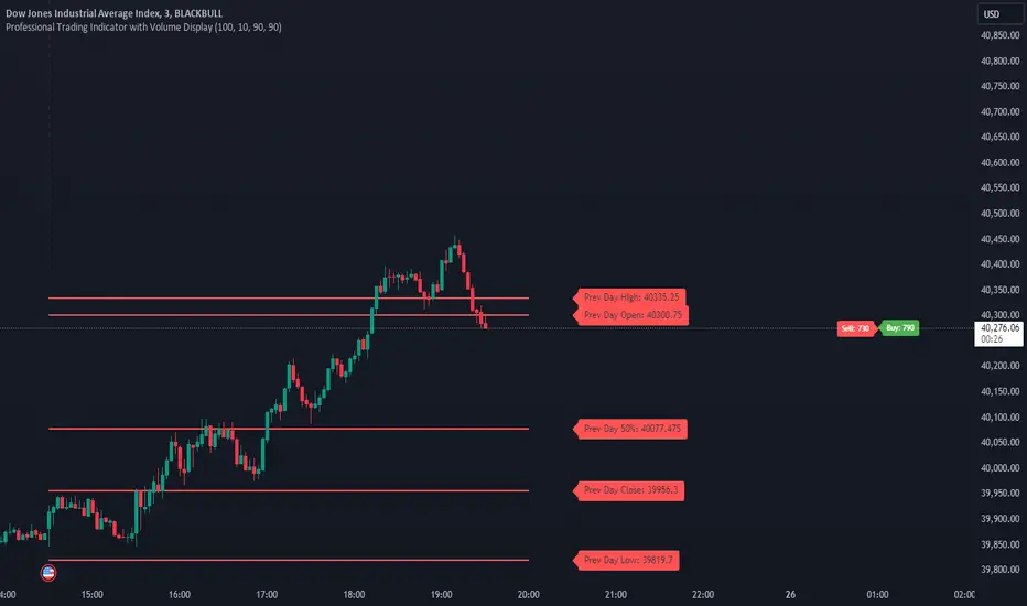
PVSRA Candles Auto OverrideWhat does this “PVSRA Candles Auto Override” Indicator
do?
This indicator automates PVSRA analysis for crypto traders. It finds the corresponding Binance Perpetual Futures chart for the current instrument, then replaces the current chart's volume profile with the perpetual futures data (if available) to ensure the PVSRA calculation uses the most relevant volume. This not only reduces human error during market scans but also automatically selects the appropriate Binance Perpetual Futures contract, saving time and improving the accuracy of PVSRA calculations.
How can a trader use this indicator?
This helps the trader to identify if there is volume data available in an equivalent Binance Perpetual Futures chart and automatically displays it, making it easier to switch coins whilst viewing the market. Why do we want to use Binance Perpetual Futures Volume? In most markets Binance volume surpasses those of other crypto exchanges so this will give us a better view on the volume spikes in the market.
What is PVSRA and how can I trade using this indicator?
PVSRA candles are a type of candlestick chart formatting. PVSRA stands for Price, Volume, Support and Resistance Analysis.
Here's a breakdown of what PVSRA candles aim to achieve:
Combine multiple factors: They take into account price movement, trading volume, and support and resistance levels to identify potential trading opportunities.
Highlight potential imbalances: By color-coding candles based on PVSRA analysis, they aim to show areas of high volume activity, potentially representing imbalances created by market makers (large institutions that influence price).
Identify areas of revisit: The theory is that these high-volume zones may be revisited by the market in the future, as there's "unrecovered liquidity" in those areas.
Usage of the Indicator:
By default the indicator will automatically use the Equivalent Binance Perpetual Chart for the Data
You can override the symbol manually if you what to view another instrument’s data.
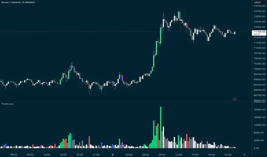
POC IndicatorThis simplified Point of Control (POC) indicator for TradingView is designed to identify and plot the price level where the highest volume of trading occurred over a specified period. The script works as follows:
Input and Initialization: The user specifies a length for the analysis period. Variables highestVolPrice and highestVol are initialized to track the price with the highest volume and the highest volume encountered, respectively.
Volume Analysis Loop: For each bar in the specified period (up to length bars back from the current bar), the script compares the volume of the current bar (volume ) to highestVol. If the current bar's volume is higher, highestVol and highestVolPrice are updated to reflect the volume and closing price of the current bar.
Plotting the POC: Instead of using a horizontal line (hline), which cannot be dynamically updated within the loop, the script uses plot to draw the POC. This plotting function draws a line on the chart that represents the closing price level associated with the highest volume observed within the analysis period.
Resetting Variables: To ensure the indicator updates correctly with each new bar, the script resets highestVol and highestVolPrice at the start of the analysis for each new period. This step is designed to recalculate the POC dynamically as new data comes in.
This approach offers a basic method for visualizing significant price levels where substantial trading activity occurred, potentially indicating areas of strong support or resistance. However, it's a simplified model and does not calculate the true POC based on a detailed volume profile across all price levels within the period.
Volume Grid [SS Premium]Hey everyone!
This is the Volume Grid indicator. It is essentially very similar to the Volume Profile Histogram indicator I released, but this premium version overlays on the chart and provides you with the tradeable ranges and the volume composition in each range. So let's get into it!
What it does:
This indicator cumulates buy and sell volume over a user defined lookback period in addition to calculating the average ranges that the stock trades in and the volume composition in each respective range.
It then paints these ranges based on the volume composition. Red means selling and green means buying. However, the brighter the red or green, the higher the buying or selling (essentially a heatmap).
The indicator will also provide you alerts when there are buying or selling volume spikes and circle the candle in which that has happened on (see example in main chart).
These alerts can of course be toggled on or off.
Trading with it:
This indicator can be used as a stand alone trading indicator, and here is how:
The ranges act as support and resistance. Within each range you can see whether the composition is buying or selling.
If we are in a green zone, it means there is buying and it is essentially a buy the dip situation (see below example):
When we are in a heavy selling zone, its essentially a short the rip situation:
You can also see when a zone transfers from a bearish or bullish zone, to the inverse:
The indicator also will plot a POC (point of control). Because we are not only pulling from daily volume data, we will already have a well established POC going into open:
This was SPY on Friday. The POC marked the current point of control from a volume perspective, which was at 482.
And here is what happened:
The POC will change colours between Red and Green, if its a bearish POC it will turn Red, bullish green. For the most part, both the bearish and bullish POCs remain within the same range but sometimes they will diverge and the indicator will alert you when this happens.
Additional options:
In addition to toggling off and on the alerts, you can also change the text colour and size.
As well, there is an option to "Condense Range". What that will do is reduce the range by a factor of 2 (in half). This will give you more aggressive support and resistance levels that you can play.
Condensed Range:
Uncondensed Range:
Personally, I prefer the condensed range, especially when trading leveraged shares, because I treat them as support and resistance levels and play breaks of them in either direction.
And last but not least, you can adjust the ranges to the daily, hourly, monthly or any timeframe you want, you simply select your desired timeframe and it will plot the ranges for that specific period:
SOXL on the week:
The yellow line represents the current period open. It is your reference line and frequently will act as support and resistance, depending on the market sentiment at the time.
That is the indicator in a nut shell, as always, please let me know your questions and suggestions below!
Safe trades and enjoy!
For access, please review the instructions below.

Balance Zone ExtensionBalance zones are an aspect of trading that many traders notice. Balance Zones are formed when a market is in equilibrium and respects a certain high and low multiple times. These zones could also be called accumulation or distribution areas depending on the price action. If the term "choppy" is used to describe a given markets price action, it is probably a fair statement to say that the market is currently in a Balance Zone.
This script is a take on vwaptrader1's teachings where you take a balance zone and "double it" to get a target if/when it does break out of balance. It provides an automated way of extending levels based on a given balance range.
The lines plotted by the script are calculated based off of the balance high/low inputs, how many sections are desired per zone, and how many boxes to plot based on the other user inputs.
Warning: Due to a current limitation of the Pine, this script is only allowed to plot up to 500 lines total. If you start to notice lines starting to disappear or you begin getting a script error, double check the input settings as the script may have crossed the 500 line threshold.
This can be used in conjunction with Fixed Range Volume Profile . Select the balance range with the Fixed Volume Profile . Note the Value Area High and Value Area Low prices and input those into the balance range High/Low inputs.
Use to create price targets from Balance Zone Breakouts
A recent example of this idea in action on ticker ES1! 2 hour chart where the balance range was found and the target (double the box size of the balance range) was hit.
Another example of this same concept but on a normal security like AAPL but on a 30 minute chart:
Extending the usefulness even further to crypto on BTCUSD with a 5 minute chart:
Use to create reference levels for future price action
The other way to utilize this is to provide future reference levels from a key balance range from the past.
Here is another example utilizing the AMD daily chart . First, a balance zone was noted for all of 2017:
Moving forward to the most recent price action in 2023, notice that the box extension levels are still fairly well respected almost 6 years later!
VWAP Boulevard [vnhilton](OVERVIEW)
The idea of this indicator comes from traders identifying supply to mainly look for shorts. Scenarios would be gap ups or pump & dumps where huge volume is transacted, & bag-holders are present. Some traders would draw resistance lines, I myself used to draw supply zones using the volume profile on that day, & others used the day VWAP on those days. VWAP Boulevard (I believe the name comes from the trader named team3dstocks) draws day VWAP lines from the highest volume days for a given period (excluding the current day).
(FEATURES)
- Draws horizontal & vertical lines from up to 250 highest volume days out of up to 3568 days, with the ability to hide either of these lines, their thicknesses, styles
- Extend/cut horizontal lines, or extend them all the way to the right
- Show the day VWAP, volume & age for these days in labels, with the ability to show what information you want to see only
- Separate customizable color forms for the lines & labels - ordinary (1 color); volume (2 color gradient from lowest to highest volume of the highest volume days); age (2 color gradient from youngest to oldest volume of the highest volume days)
- Edit offset & size of labels, & hide them
- Hide vertical lines
From left to right: Age color; ordinary color; volume color
250 highest volume days in the past year. Very messy so it's very likely you won't be using this but the ability to draw lines from 250 highest volume days is there if needed
(DRAWDOWNS)
- This indicator will only on the daily timeframe (error message will show up if unaware of this, & can be toggled off). Unfortunately, this would mean you would have to draw the lines manually yourself if you wish to use them on intraday timeframes.
- You may also encounter the 'Pine cannot determine the referencing length of a series. Try using max_bars_back' error. This occurs when the lookback period is very high & the indicator attempts to recalculate I believe. If this happens then reload the indicator.
The logic I used to obtain the highest volume days were to put all of the volume days in a given period in 1 array, then to sort them from highest to lowest, & also store their sorted indices in an separate array as well, so that drawings for each volume day could be done from the 2 arrays.
//Volume for last N periods
var int pastVol = array.new_int(lookbackPeriodFixed)
for i = 0 to lookbackPeriodFixed - 1
array.set(pastVol, i, int(volume ))
sortedIndices = array.sort_indices(pastVol, order.descending) //All Indices of sorted volume from highest to lowest
sortedIndices2 = array.slice(sortedIndices, 0, highestVolDays) //Indices of sorted volume from highest to lowest
array.sort(pastVol, order.descending) //All Volume sorted from highest to lowest
pastVol2 = array.slice(pastVol, 0, highestVolDays) //Volume sorted from highest to lowest
//Drawings
for i = 0 to highestVolDays - 1
index := array.get(sortedIndices, i)
vol := array.get(pastVol, i)
Since these array sizes were determined from the lookback period, it would mean that the request.security() function used to obtain daily values on intraday timeframes wouldn't work for a lookback period >20 (20 * 2 values I believe, which are the day VWAP & the day volume) as TradingView has put a maximum amount of calls of 40 in 1 script. Therefore, for intraday plots to work I would have to change the logic for getting the day VWAP & day volume for the highest days, as the request.security() function doesn't work on for loops, & this would also mean that the user would only be able to draw lines from up to 20 highest volume days instead of 250. I couldn't go forward with this as I wasn't able to find the logic to pick the highest volume days & their day VWAPs & times (indexes) without using a for loop. If anyone has any solutions (including for the 'Pine cannot determine the referencing length of a series. Try using max_bars_back' error) then please let me know. I've also left commented-out code for dealing with intraday drawings for future use.

RSI ProfileThis indicator shows the RSI profile from historical RSI Value and High / Low RSI Pivots.
It is inspired by the Volume Profile which is a common charting study that indicates activity at specified levels. It plots a histogram on the chart meant to identify dominant/significant levels.
This script is profiling RSI levels into a histogram, which can identify the crucial RSI values in the chart. Along with the pivot options that can help identify the dominant pivot points where RSI values had been rebounding historically.
How to use:
There are three profile types available in the settings. When selecting RSI Values, the indicator will count RSI values from history, and plot the count in a histogram at the end of the chart. If you select RSI Pivots High or RSI Pivots Low, the indicator will count only the RSI Pivot Highs and Lows and plot the count in a histogram. Users can select the Pivot Left/Right length from the settings.
Users can extend the POC line to the left, to study how the values had been reacting to POC
Please note: Since the RSi values range from 0 to 100, the indicator is rounding off the values to absolute numbers. This can cause a situation where multiple POC are identified, to find the unique POC, you can increase the width of the histogram.
The Max/Min RSI settings are for visual purposes only, it can help users shrink down the histogram's top and bottom visibility
Auto Support & Resistance Volume Based + ScannerThis indicator tracks large marker maker orders and draws support & resistance levels based on where those orders came in. It allows you to track what the market makers are doing and place your trades in line with them. Look for the lines to suck up to the price and that will show you where large orders are coming in which is where reversals will happen or trend continuation will happen at an accelerated rate. The fat lines are higher timeframe volume spikes and major volume spikes. Look for bounces off of these fat lines. The fatter the line, the bigger the volume spike. The skinny lines are minor volume spikes over shorter time periods. These can be viewed as short term support and resistance levels and consolidation zones.
***HOW TO USE***
Look for bounces off of the fat lines and place trades accordingly. Those levels are where the market makers placed their orders and you will notice how well price reacts to these levels.
Look for the lines to suck up/down to the price. This shows you where volume is coming in which typically means a reversal is about to happen. If a reversal doesn’t happen, then the trend will continue its original direction, but usually move faster. Wait for these lines to suck up to price before trying to buy the bottoms or sell the tops. If you can have the patience to wait for this to happen, it will keep you out of a lot of choppy price action and give you very good places to take trades that move quickly.
When all the levels suck up to the price and all the colors change to red from green or green from red, it is an indication of market sentiment changing and the trend will likely reverse.
For best results, use this on charts for exchanges that have the highest volume and the most institutional buyers as those will give better levels since there are more market makers on those exchanges. Use exchanges such as NYSE, ARCA and NASDAQ for stocks and use COINBASE, BINANCE, MEXC perpetual futures charts or PEPPERSTONE for crypto.
If price breaks out or down from the group of levels and no lines suck up to the price, then it is a low volume breakout and price usually comes right back to the support and resistance levels so beware when this happens.
If there are no levels near the current price, look at the previous levels in that price range as those are still very relevant areas.
You can also draw trendlines from recent high and low points of the lines where they changed, which works very well for finding tops/bottoms in confluence with the real time s&r levels.
I recommend looking at higher timeframes and drawing horizontal lines where the fat lines are that extend for a long period of time. Then you will have those levels on your lower timeframe charts so you don’t miss any major levels that price will likely bounce off of.
Make sure you spend some time looking back at historical data so you can get a feel for how this indicator reacts to volume spikes before using it.
***HIGHER TIMEFRAMES***
This indicator scans higher timeframes for volume spikes, so make sure you update the higher timeframes used when looking at anything higher than the 1 minute timeframe as that is what the settings are optimized for. You can create new chart layouts for each timeframe you use frequently and save your settings on each chart so that you don’t have to update those settings when you switch timeframes.
***SCANNER***
The table at the bottom of the screen scans 8 other tickers for volume spikes. When a volume spike is detected, the color of that ticker will change from blue to orange to notify you. You can customize which tickers the indicator scans within the indicator settings. Make sure to save your chart layout with your updated tickers so you don’t have to change them frequently. Input all tickers from a certain sector to see how that sector is performing overall which can help give you a good idea of the sector as a whole. Save a different chart layout with each different sector you want to scan so you don’t have to switch the tickers frequently.
***ALERTS***
This indicator is set up with alerts that can be turned on to notify you of volume spikes on the ticker that the chart is set to.
***CUSTOMIZATION***
You can customize the colors of the lines and backgrounds in the indicator style tab. You can also turn off the scanner if you want to within the indicator input tab. The tickers to scan can be customized to suit your preferences within the indicator input tab. The higher timeframes used can also be adjusted within the indicator input tab.
***MARKETS***
This indicator can be used on all markets that have volume data, including stocks, crypto, futures and forex.
***TIMEFRAMES***
This indicator can be used on all timeframes as long as there is enough data for the session used.
***TIPS***
Try using numerous indicators of ours on your chart so you can instantly see the bullish or bearish trend of multiple indicators in real time without having to analyze the data. Some of our favorites are our Trend Friend Signals, Volume Profile with Buy & Sell Pressure, RSI Scalper Ribbon and Auto Support & Resistance with Wick Signals to find those major levels that are not associated with volume spikes in combination with this volume based auto support and resistance indicator.

WMACDThis is MACD but little different.
The idea behind this is to use MACD to find resistance and support level first. So we can use the logic of volume profiles for this setting and by imply the MACD on it you can make the hybrid for it .
The line represent the both resistance level and if macd is above or bellow the zero
if line is red the macd is bellow zero if it lime then it above zero .
The bars represent the macd (in gray) - left side is buy and right side is sell
so how to use it ?
for example : if MACD is red and price is bellow the line we are in bear state and the line represent the resistance
lets say price bellow the line and macd line is green then this is buy signal and our goal is to reach the price of the supposed resistance
, if price break the line up then we are in bull time mode and strong buy .
Now our line will become the support line .
you can change the setting of the MACD to make it more sensitive or less sensitive as regular macd with fast and slow length
This is a concept idea how to make the MACD to find resistance and support level
so try to play with it to see how it work